Dive Brief:
- Marco’s Pizza debuted its new store design in the Boise, Idaho, market on July 23, the company said in a press release Wednesday.
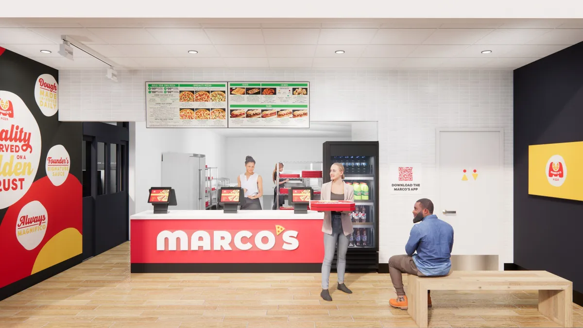
- The prototype aligns with the brand’s platform “But Wait, There’s Marco’s” and has a brighter, modern look and feel. It has an option for a pickup door and window as well as a QR code on a designated wall for customers to order through the app in-store.
- The new design is expected to help the chain’s ongoing nationwide growth. Marco’s, which reached 1,200 units last year, has identified 4,200 potential locations across the U.S. and has a plan to open 300 units annually over the next few years.
Dive Insight:
The redesign includes new equipment aimed at improving the customer experience. Marco’s is testing warming racks and pizza lockers that can hold multiple orders for pick up and delivery. The store has a beverage cooler placed next to the front counter so employees and customers can add beverages on to orders, in addition to a small waiting area.
"This redesign is not just about aesthetics; it's about enhancing the customer experience, improving operational efficiency, and creating a welcoming environment that reflects our commitment to quality and innovation,” Marco’s Co-CEO and President Tony Libardi said in a statement. “As we continue to expand, these new stores will set the standard for our brand.”
The chain is testing the prototype in Boise, Idaho, because it has identified the area as a strong market it can use to pilot “forward-thinking innovations,” according to the press release. Earlier this year, Marco’s said it would open four locations in Boise, with the potential to reach 12 units.
The company has been focusing on multi-unit growth and nearly half of its current franchisees are operating more than one location. Marco’s is using technology to help identify territories for expansion and offers franchisees support in real estate, construction management, field operations and other areas.
Several other chains have redesigned their stores to create more seamless experiences, especially for digital customers. Earlier this year, Potbelly rolled out a 1,800-square-foot design — 500 square feet smaller than its traditional units — that uses a digital board to better communicate which orders are being prepared and which are ready for pickup. Burger King committed $300 million to remodels across its system earlier this year as part of its larger plan to improve store operations. Burger King’s Sizzle design includes digital pickup and drive-thru elements.


