Dive Brief:
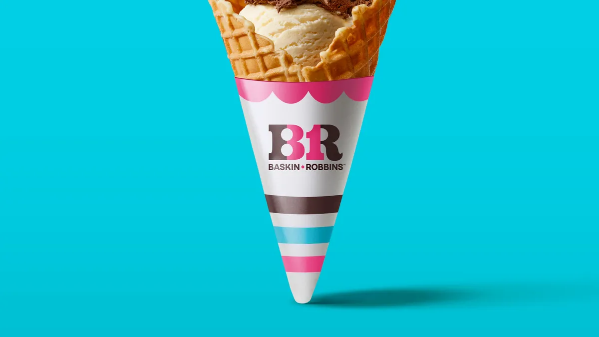
- Baskin-Robbins announced Monday it is introducing a new logo, branding and packaging in its first major relaunch for the U.S. and Canada in nearly two decades, according to details emailed to Marketing Dive. The new theme encourages customers to appreciate life's moments through the tagline "Seize the Yay."
- To celebrate the refresh, the Inspire Brands-owned ice cream chain debuts three flavors and will launch its first line of merchandise, including clothing, hats and a bike, available online starting April 18. A creative campaign launches today with two 15-second spots depicting kids enjoying a scoop after learning to ride a bike and surviving the first day of school.
- Building on updates to the chain's logo and typeface in late 2020, the new brand refresh was designed by agency ChangeUp, while the supporting creative campaign was developed by 22squared.
Dive Insight:
Baskin-Robbins, which has over 2,400 locations in the U.S., joins a growing list of brands freshening up logos and taglines so far this year. The 77-year-old ice cream purveyor, known for its "31 flavors" tagline, is shaking up its identity to focus on celebrating life's small moments, seemingly shifting to a more consumer storytelling approach rather than emphasizing its flavor count. The number 31 remains a key part of the chain's packaging, with the number hidden amongst the "BR" logo that now sports cleaner lines and a less busy typeface.
Its fresh look and tagline aim to acknowledge the role ice cream plays in consumers' lives while still highlighting Baskin-Robbins' legacy of tying in the "31" element.
"Small moments that spark joy often get taken for granted. We're encouraging people to pause and celebrate any moment that brings happiness with Baskin-Robbins," Jerid Grandinetti, the chain's vice president of marketing and culinary, said in the announcement.
The ice cream chain's updated look follows refreshes by legacy brands including M&M's, Coca-Cola and Anheuser-Busch earlier this year. Each used different tactics to highlight their respective marketing priorities, but all appear to be using their brand makeover to better fit a landscape repeatedly altered by the pandemic and charge ahead with a simplified, realigned message.


