Campaign Trail is Marketing Dive's analysis of some of the best and worst new creative efforts from the marketing world. View past columns in the archives here.
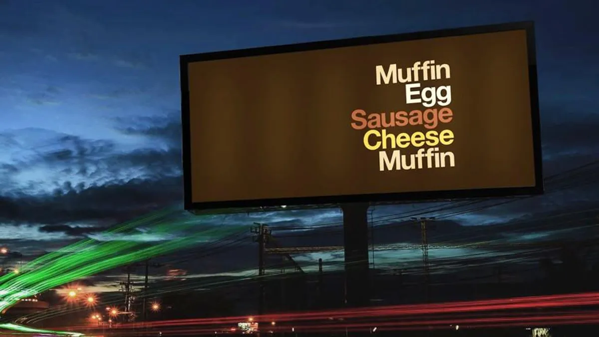
Some brands are so iconic, they don't need a logo or name for their advertisements to work. This was the idea behind McDonald's decision to introduce billboards earlier this month stripped of nearly all branding — missing are the recognizable golden arches, "I'm Lovin' It" slogan and product photos — save for a stack of words showcasing the ingredients in its core products.
Rather than promote a new menu item or drive-thru feature, the fast-food behemoth is using the minimalist campaign to flex the visual identity it's built over decades and convey a single, broader message around McDonald's having reached iconic status, according to Monotype's Type Director Charles Nix.
"It's almost as if they own these words now," Nix told Marketing Dive. "The beauty and pleasure of a word map is that by reading it, the object reveals itself. That's just the pure poetry of these things: Once you read it, it becomes the thing."
From ad to art
The ads' style stems from a T-shirt created by graphic design studio Experimental Jetset in 2001. Originally featuring The Beatles members' first names, the now familiar word-stack layout was intentionally crafted to strip down the idea of a rock band and reach the essence of the group through neutral typeface Helvetica, per Experimental Jetset.
In McDonald's "Iconic Stacks," created with Leo Burnett London and design studio David Schwen, selecting Helvetica over the brand's custom typeface Speedee may have positioned its products and brand as even more iconic, according to Nix.
"Had they gone with Speedee, it wouldn't look like a work of art; it would look like an advertisement." he said.
"There's almost this combination of humbleness and confidence. McDonald's is so confident in the words that they're willing to use something so ubiquitous like Helvetica," Monotype CMO Brett Zucker added.
"You need the ongoing repetition of this idea that McDonald's owns fast-food sandwiches ... that primes the pump in our brains."

Charles Nix
Type director, Monotype
The concept underpinning McDonald's "Iconic Stacks" campaign surrounds intentionally designing ads to not look like paid placements, as many consumers have grown blind to ads after being inundated for years. The expectation is that by forgoing the brand's classic imagery in the new creative, this will compel passersby to pause and consider McDonald's, much like Pavlov's dog and a bell.
McDonald's is so embedded in consumers' subconscious and ingrained in culture that people don't need to see "food porn" photos typical to fast-food marketing to understand an ad's message, Nix said. But only a few global brands have the broad awareness and heft to communicate without a logo.
"You need the ongoing repetition of this idea that McDonald's owns fast-food sandwiches. There are other restaurants that make them, of course, but if I were to ask 10 people to name the first fast-food place that comes to mind, nine out of 10 would say McDonald's. That primes the pump in our brains," Nix said.
Building a strong visual identity
"Iconic Stacks" is just the latest example of McDonald's paring down its branding to more minimalist designs. In December 2019, the chain packed a punch with a series of simple product icons on Instagram Stories, highlighting a larger marketing trend of "no brand" branding popularized by the now-defunct startup Brandless. While Brandless' bold positioning as being "brandless" weakened its ability to distinguish itself, McDonald's retains a level of global brand equity built over decades of growth, marketing and tweaking its visual identity.
"[It has] spent billions of dollars and 60 years reinforcing an identity to get to this iconic status. To the extent that it reinforces consistent colors, words, all these different imageries and shapes and sounds — it's like muscles. Only if you use them will they continue to work," Zucker said.
"You mitigate the risk of turning people off if you stay true to your core visual DNA."

Charles Nix
Type director, Monotype
McDonald's, like most companies, continuously evolves its branding to keep up with changing consumer tastes. One challenge during these revamps, according to Nix, is the "weird balancing act" of updating a visual identity without putting off customers or sacrificing the equity a brand has developed.
"On the one hand, you have to trust your consumers that they'll follow you on the journey of your evolution. But on the other, you can't suddenly appear completely different and have them be alienated by you," he said. "You mitigate the risk of turning people off if you stay true to your core visual DNA."


